Your website should look
as good as your product is.
Komplier helps businesses create marketing assets for Tap to Pay on iPhone. Precision is central to the product. The website needed to communicate that same standard.
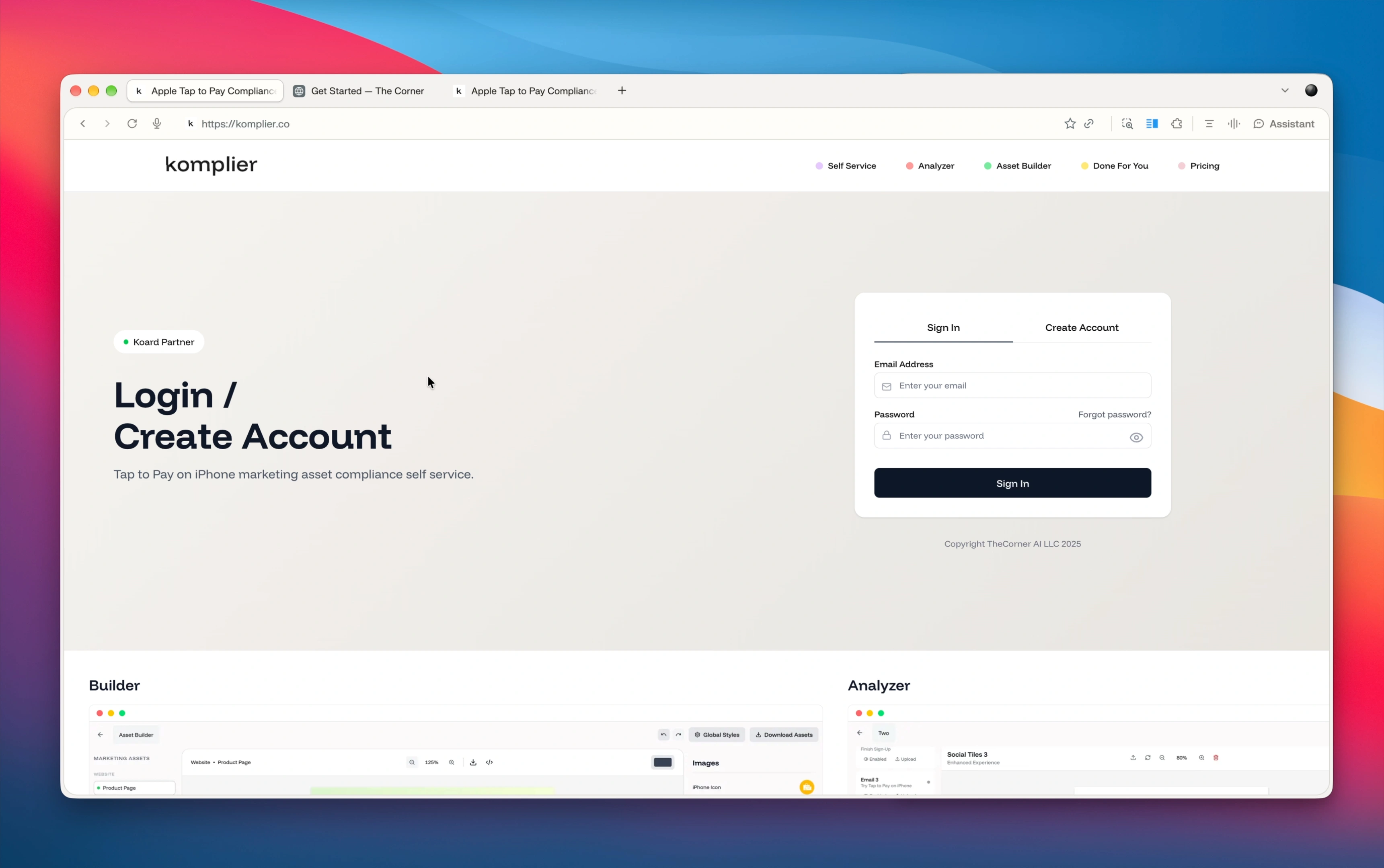
The starting site explained the offering, but its presentation didn’t reflect the premium positioning of the business. When you’re asking customers to trust you with detailed, brand-sensitive work, the first impression matters.
The brief was straightforward: bring the website up to the level of the product, with a visual direction the client already loved.
Less guessing.
More “that’s the one.”
Rather than trying to describe a look in abstract terms, Komplier brought a website reference through our intake process. It gave the project a concrete starting point: clean layouts, confident typography, and a polished, professional feel.
We used that direction to shape the experience around Komplier’s own offering, content, and customer journey, with adjustments along the way. The reference made the aesthetic clear. The business information made it theirs.
You don’t need a design vocabulary. Bring a site you love and tell us what your business does. We’ll help turn that direction into your own website.
Find your starting pointThe same business.
A different first impression.
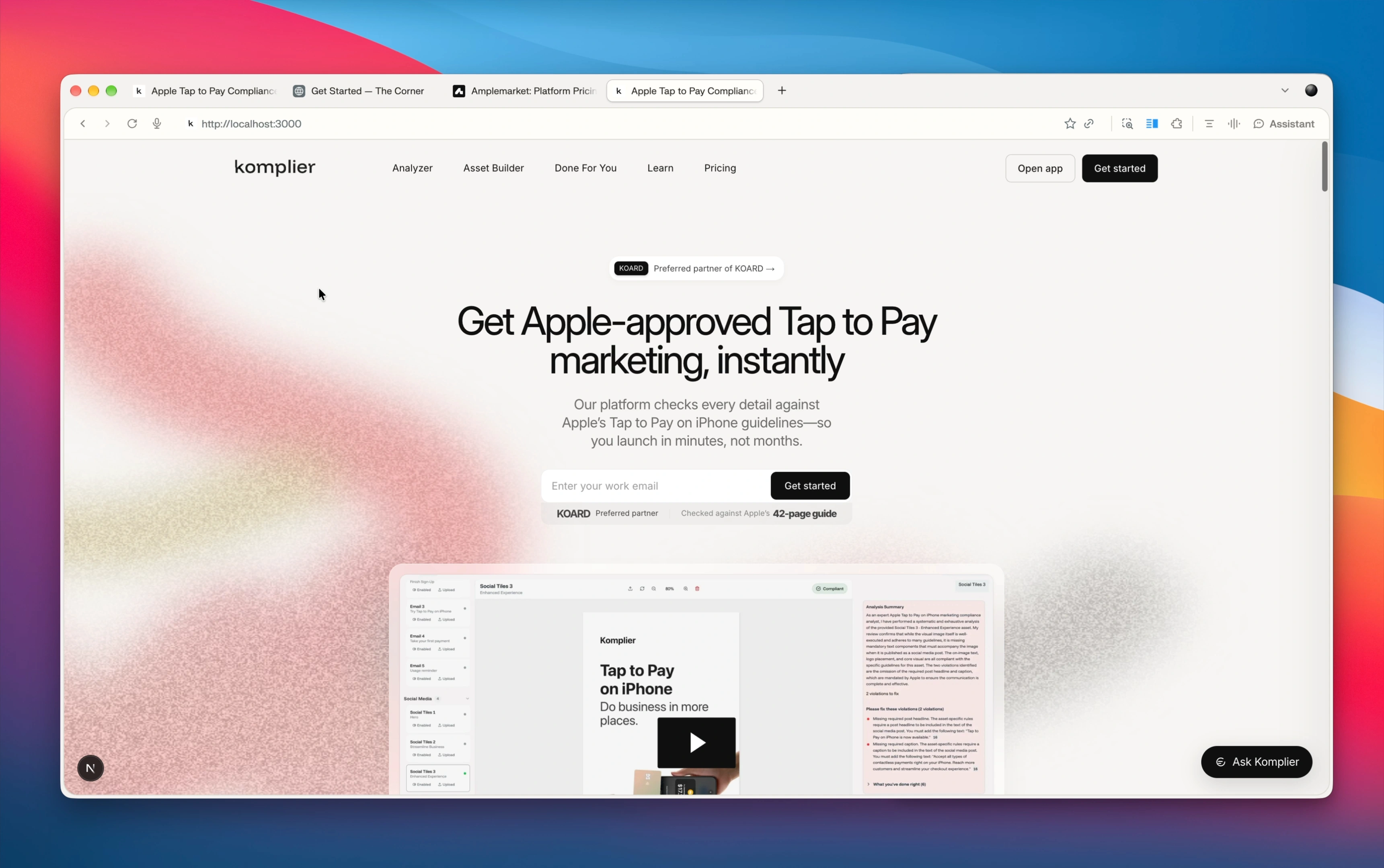
The redesign carries Komplier’s information into a more considered experience, from the opening message to the product story and pricing.
The goal is to make the quality of the business easier to see. Product information, visual hierarchy, and the path to getting started work together, giving visitors a more coherent introduction to what Komplier offers.
A beautiful site is the start.
Context is what comes next.
The walkthrough then goes behind the page. Alongside the site’s code sits a collection of information about the business: documentation, product details, and contextual guidance.
That information gives future AI-assisted changes a reference point. A new blog post or feature can draw on the business’s existing knowledge instead of starting from an empty brief every time.
For a business built around precise messaging, that foundation matters. It helps future work stay connected to what the company does, how it speaks, and what its customers need to know.
“Add a chat interface.”
And make it feel like us.
The final part of the video shows what that foundation makes possible: an assistant designed to fit the website and draw on its documentation.
The request was specific. Open the chat in a side drawer. Keep it visually consistent. Reference the available documentation. And when a visitor needs more involved help, prepare an email they can open in their own email app and send.
The demo shows a visitor asking a product-specific question and getting an answer with references. The conversation can then move toward the service the visitor needs. The interface belongs to the site, and the information comes from the business.
That’s the larger opportunity: a website that can become more useful over time, without having to explain your entire business again for every change.
Raise the standard.
Keep moving.
Komplier’s walkthrough brings the two sides together: the polish customers see and the context that supports what happens next. A stronger presentation today, with a foundation for tomorrow’s content and features.